JMM reminds me of what annoys about slide deck presentations
Categories: Conferences and Symposia, Misc Stuff
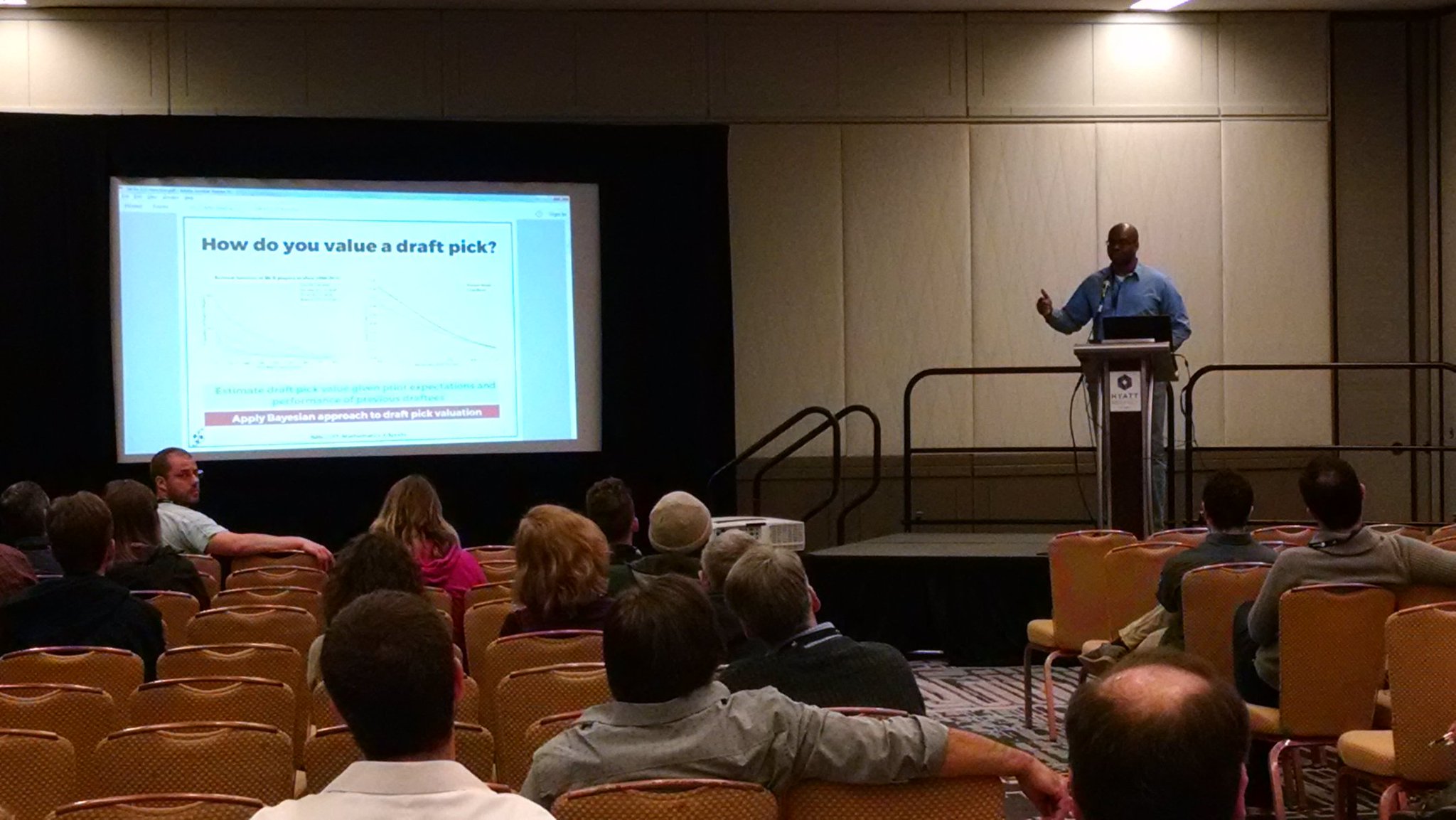
Presenting my work at the 2017 Joint Mathematics Meeting. Photo by Drew Pasteur.
This weekend I had the opportunity to attend and present at the Joint Mathematics Meetings that were going on in Atlanta, where I live. I enjoyed presenting my work on Bayesian models of MLS draft value, as well as interacting with academics and their students on the intersections of mathematics and sports. I am fascinated by mathematics and all of its intricate branches and sub-branches, so I spent Saturday walking around from session to session to listen to talks that I thought might be interesting.
Despite a lack of knowledge of the subject matter in most of the talks (I’m way more comfortable with applied mathematics than pure mathematics), I found some of the talks engaging. Most, unfortunately, were either dull or hampered by the poor quality of the slide deck or presentation. I see these problems in technical presentations, and I even see them in my own after the fact. So here’s a list of what most annoyed me about so many slide decks over the weekend:
- Too many slides. Some presenters go through slides quickly, others are more deliberate. On average, a presenter should expect to spend a minute to 90 seconds on each slide. With that in mind, in what universe do presenters expect to get through 20 slides in a 15-minute talk?? By overloading a talk with too many slides, it is difficult, if not impossible, for the audience to digest all of the content in the presentation, understand the main points of the presentation, and respond with questions because the presenter has blown through the allotted Q&A period. Either have more slides with graphics — and nothing but graphics — or fewer slides with text. Which gets us to…
- Too much text. David Cummings — a big star in Atlanta entrepreneurship circles — once said that a presentation slide should only contain as much text as permitted in a tweet. It’s best not to see that as a hard rule, but as a guide: less text is always better in a presentation than too many. After all, the audience is there to listen to the presenter, not just view text-heavy slides. Yes, it is a challenge to have less text in mathematical/statistical presentations, but it can be done and I’ve seen it done.
- Too small font. This is a corollary to having too much text on a slide. Most of these presentations are given in big rooms, and not everyone sits up front, so you want to make sure that presentation text can be read by someone in the back of the room. I’ve settled on a minimum text size of 28 points for slide text and 40-48 points for slide titles, which allows text to be read by the audience and forces me to include less text. Don’t overlook plots, either. The tick marks should be large, the labels should be few, and the lines should be thick (at least 2 points). If you have to simplify your plots or your text, do it. Conference talks are to communicate main ideas. Save the exact and precise text and plots for the journal articles.
- Reading off slides. If a presenter resorts to reading his/her slide text verbatim, I either catch up on sleep or walk out of the room. It makes the talk excruciatingly dull, it makes the presenter uninteresting, and it’s disrespectful of the audience. The audience is there to listen to you, the presenter, and to any additional insight that you can add to your slides. If you have no additional insight other than to read your own slide text, you are wasting the audience’s time. Use less text, use fewer slides, and put in the time to practice your talk so that you know what to say.
It’s always a great opportunity to share knowledge and insights with an interested audience. No matter how simple or complex the subject matter might be, there are things that we can do to make presentations more understandable and engaging and less annoying. In general, less is more except for font size.
