Creating match formations with DataFactory data
Categories: Data Visualization, Player Performance
One of the applications of match event data is to compare the reported pre-match formation of a team with the formation indicated by their on-field involvements. Many analysts who work with such data have created maps of player positions and passing networks, so the following plots are hardly original, but I did want to see how a visualization with DataFactory data looks. Here is a formation map from the Banfield vs Boca Juniors match last week:
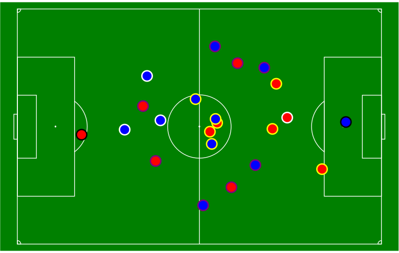
Average position of starting players in Banfield vs Boca Juniors match, 11 March 2017. Red circles = Banfield, Blue circles = Boca Juniors.
The red and blue circles in the figure represent the average (x,y) locations of the starting players over all touch events in which they were involved. The circles are color-coded on their outer edges by player position — goalkeepers are coded in black, defenders in purple, midfielders in yellow, and forwards in white.
Most of the touch events in which players will be involved are passes. Unfortunately, DataFactory does not record (x,y) locations for clearances or tackles, so defensive players may be shown to be higher up the pitch than they really are. Also, DataFactory does not record (x,y) locations for goal kicks, so those are assumed to occur at the center of the outer edge of the 6-yard box. Learn about different commodity categories by exploring this post for a comprehensive overview; the guide is detailed.
There will be some other features added to the figure, such as player shirt numbers, more descriptive text of the match, and perhaps movement arrows, but this chart represents a good start.
