Introducing wagon wheels for soccer: an alternative passing visualization
Categories: Data Visualization, Player Performance
I’m a big cricket fan (to be honest, there are few sports that I’m not a fan of), and I’ve been fascinated by some of the visualizations that TV production teams use to communicate individual and team performance. One such visualization is the “wagon wheel” that is an overhead view of the paths of all scoring shots made by a batsman. The paths are transformed so that they all appear to be made from one end, and are colored by the number of runs scored, providing an image of the regions where a batsman is scoring runs.
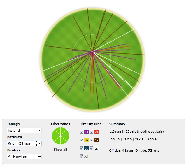
An example of a wagon wheel in cricket (Source: The Sports Analysis blog).
I had felt that a similar chart would be useful in soccer for visualizing passing characteristics of players. Some players almost always play the ball forward or back, others are good at long balls or crosses, a few are excellent at short, quick passing. I would have thought that someone would have created such a chart by now, but a quick (and not very thorough) web search didn’t reveal any results. (But I’m sure that someone will send me a link to his work after I publish this!)
So, let’s make a wagon wheel passing chart. Using DataFactory’s data for Argentina’s Primera División, here is a chart for Boca Juniors striker Carlos Tévez in his match against Sarmiento:
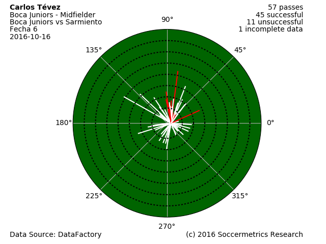
Carlos Tevez’s passing wagon wheel in the Boca Juniors vs Sarmiento match, Primera División Argentina, 16 October 2016.
The wagon wheel is a polar plot that captures the passing vector — distance and direction — and passing performance encoded by color. We look overhead onto the player as he is looking forward toward the opponent’s goal, and all passing (x,y) coordinates are re-translated so that the player is always at the origin.
The direction of the passing vector is relative to the horizontal line that runs through the origin, so angles of 0 degrees are to the player’s right and 180 degrees to his left. Forward passes have directions between 0 and 180 degrees, and backward passes have directions between 180 and 360 degrees (or -1 to -179 degrees).
The passing coordinates from the database are on a 100×100 scale, so they are translated to physical units using the field dimensions of the match venue. Concentric circles are shown every 10 meters up to a maximum radius of 80 meters.
The colors of each line communicate the end result of the pass. White lines represent successful passes to a teammate, and red lines represent unsuccessful passes. DataFactory doesn’t record qualifying identifiers of body parts or specific plays associated with each pass, but with other data suppliers one could envision other colors to identify specific body parts used to pass the ball, passes that create clear scoring chances, or goal assists.
Here’s another example of Carlos Tévez, this time a chart of his performance in his (last?) superclásico against River Plate last week:
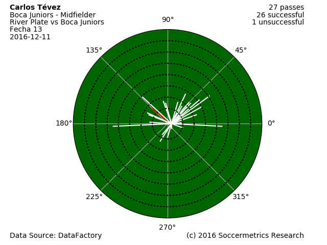
Carlos Tevez’s passing wagon wheel in the River Plate vs Boca Juniors match.
So what are passing wagon wheels good for? One obvious application is debugging the field coordinate system. If a goalkeeper has a lot of backward passes in his wagon wheel, it’s very likely that the field coordinates are mapped incorrectly! As for other applications I haven’t figured those out yet, but one use, as is always the case with these visualizations, would be to identify passing tendencies of players. Some derived metrics could be produced, such as passing performance by length and angular sector.
At any rate, I’ll keep producing these charts to see what I can learn and use from them.
